Table of Contents
Contents
How to use Box-and-Whisker plots in python
Table of Contents
- Introduction
- What Is a Box-and-Whisker Plot?
- Why Use Box Plots?
- Creating Box Plots in Python
- Customizing Box Plots
- Conclusion
If you aren’t well versed in statistics or data analysis, you may not be familiar with box and whisker plots (box plots). Box plots are a powerful visualization tool for getting a basic understanding of the distribution of some sample data. In this article, we’ll cover what box plots are, break down their components, and walk through detailed examples of how to create and customize box plots in Python.
What Is a Box-and-Whisker Plot?
A box and whisker plot (or box plot) is a standardized way of displaying the distribution of data based on five summary statistics:
- Minimum (excluding outliers)
- First quartile (Q1): 25th percentile
- Median: 50th percentile
- Third quartile (Q3): 75th percentile
- Maximum (excluding outliers)
The “box” shows the interquartile range (IQR), which is the distance between Q1 and Q3, and the line inside the box indicates the median. “Whiskers” extend from the box to the smallest and largest values within 1.5 times the IQR. Points beyond the whiskers are often plotted individually as potential outliers.
Why Use Box Plots?
- Quick Summary: They give a clear summary of data distribution, spread, and central tendency.
- Outlier Detection: Box plots help identify outliers in the dataset.
- Comparison: When plotted side by side, they are useful for comparing distributions across different groups or categories.
Creating Box Plots in Python
Python provides several ways to create box plots, with the most common libraries being Matplotlib, Pandas (which builds on Matplotlib), and Seaborn. In the examples below, we’ll start with Matplotlib and then show how to leverage Pandas for a slightly higher-level interface and end with Seaborn.
1. Using Matplotlib
Basic Box Plot
The plt.boxplot() function in Matplotlib creates a basic box plot from an array of data. Here’s an example using synthetic data:
import matplotlib.pyplot as plt
import numpy as np

# Generate sample data: 200 data points from a normal distribution
data = np.random.normal(loc=100, scale=20, size=200)

# Create the box plot
plt.boxplot(data)

# Add title and labels
plt.title('Box Plot of Sample Data')
plt.ylabel('Values')

# Display the plot
plt.show()
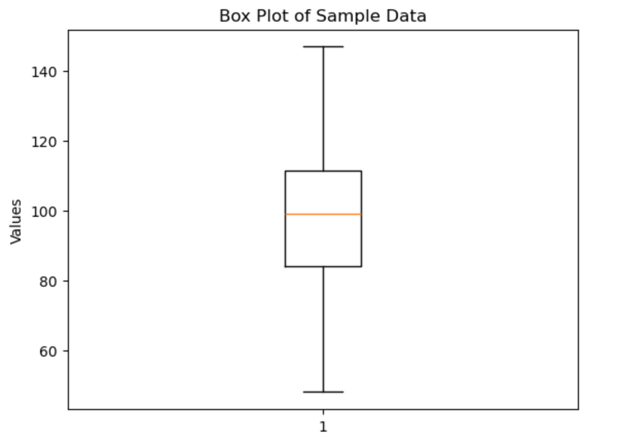
Explanation:
- We generate random data using NumPy’s
random.normal(). plt.boxplot(data)automatically calculates the median, quartiles, and identifies outliers.- Titles and labels are added to improve readability.
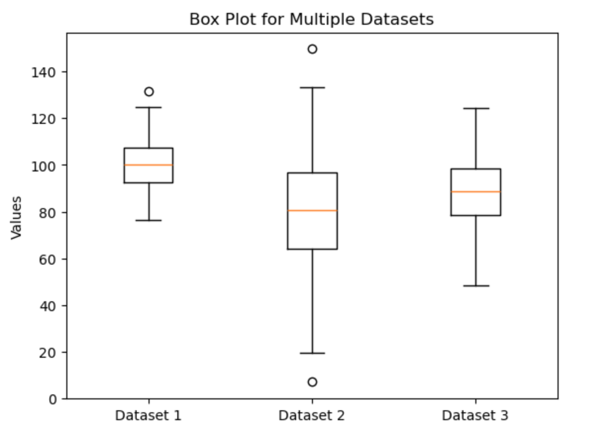
Multiple Datasets
You might want to compare several datasets side by side. Here’s how you can do that:
import matplotlib.pyplot as plt
import numpy as np

# Generate three datasets with different distributions
data1 = np.random.normal(100, 10, 200)
data2 = np.random.normal(80, 20, 200)
data3 = np.random.normal(90, 15, 200)

# Combine datasets into a list
data = [data1, data2, data3]

# Create the box plot
plt.boxplot(data)

# Add title and custom x-axis tick labels
plt.title('Box Plot for Multiple Datasets')
plt.xticks([1, 2, 3], ['Dataset 1', 'Dataset 2', 'Dataset 3'])
plt.ylabel('Values')

# Display the plot
plt.show()
Explanation:
- Three different datasets are created.
- Passing a list of arrays to
plt.boxplot()creates a side-by-side box plot for each dataset. - The
plt.xticks()function is used to label each box plot with a custom name.
2. Using Pandas
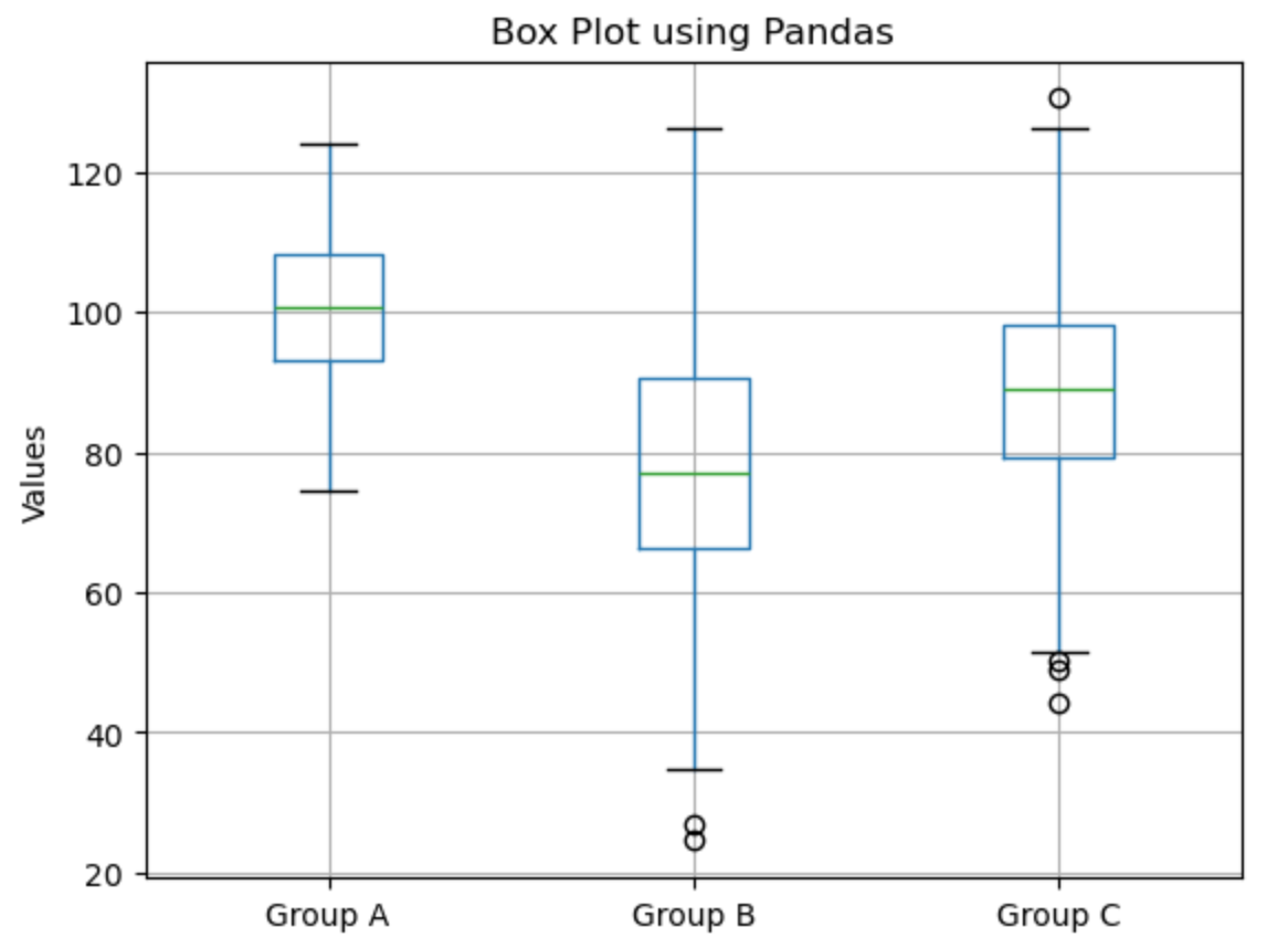
If your data is in a Pandas DataFrame, you can use its built-in plotting capabilities to quickly generate box plots.
Example with Pandas
import pandas as pd
import numpy as np
import matplotlib.pyplot as plt

# Create a DataFrame with synthetic data
np.random.seed(0)  # For reproducibility
df = pd.DataFrame({
    'Group A': np.random.normal(100, 10, 200),
    'Group B': np.random.normal(80, 20, 200),
    'Group C': np.random.normal(90, 15, 200)
})

# Generate a box plot using the DataFrame's built-in method
df.boxplot()

# Add title and y-axis label
plt.title('Box Plot using Pandas')
plt.ylabel('Values')

# Display the plot
plt.show()
Explanation:
- A DataFrame is created with three columns representing different groups.
- The
.boxplot()method on the DataFrame automatically generates a box plot for each column. - This method is particularly useful when working with structured data.
3. Using Seaborn
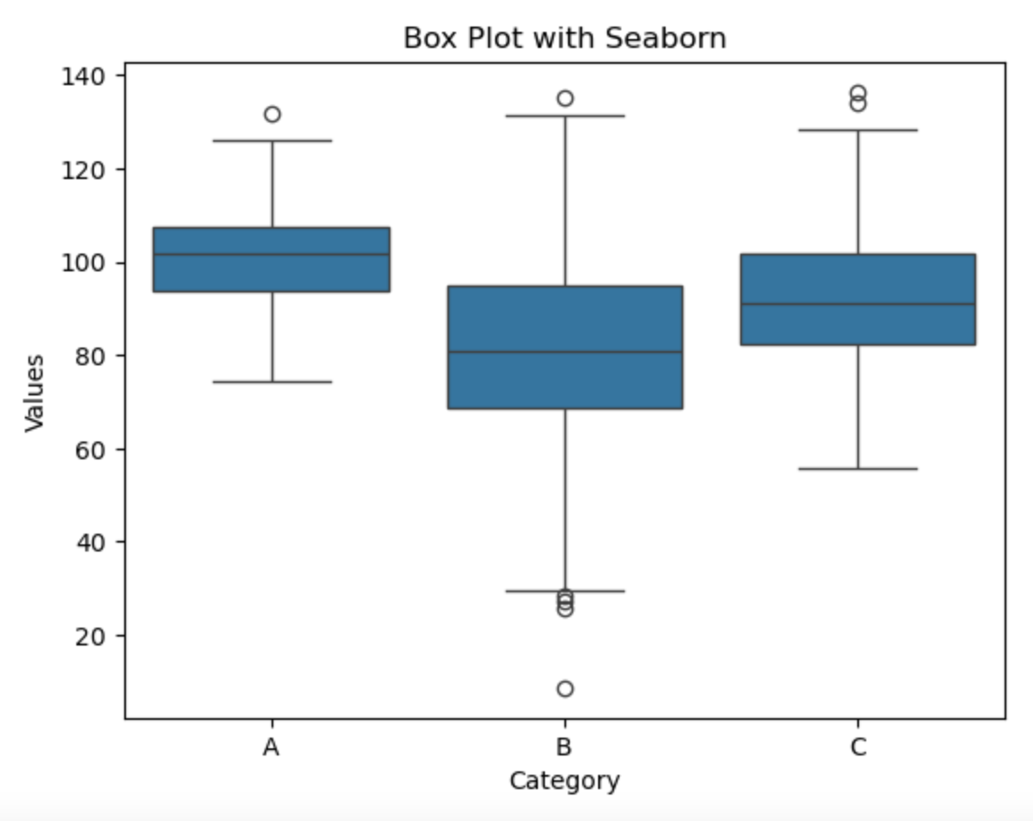
Seaborn is a statistical data visualization library built on top of Matplotlib. It provides a more visually appealing and intuitive way to create box plots.
Basic Box Plot with Seaborn
import seaborn as sns
import matplotlib.pyplot as plt
import numpy as np
import pandas as pd

# Create sample data
df = pd.DataFrame({
    'Category': np.repeat(['A', 'B', 'C'], 200),
    'Values': np.concatenate([
        np.random.normal(100, 10, 200),
        np.random.normal(80, 20, 200),
        np.random.normal(90, 15, 200)
    ])
})

# Create the box plot
sns.boxplot(x='Category', y='Values', data=df)

# Add title
plt.title('Box Plot with Seaborn')

# Show the plot
plt.show()
Explanation:
Seaborn makes it easy to plot data directly from a DataFrame using sns.boxplot().
We specify x='Category' to group data and y='Values' to plot the distributions.
The result is a clean, informative visualization with default styling.
4. Using Plotly
Plotly is an interactive visualization library that creates web-based charts. It’s particularly useful when you need interactive plots that users can hover over, zoom in/out, or export.
Basic Box Plot with Plotly
import plotly.express as px
import numpy as np
import pandas as pd

# Create sample data
df = pd.DataFrame({
    'Category': np.repeat(['A', 'B', 'C'], 200),
    'Values': np.concatenate([
        np.random.normal(100, 10, 200),
        np.random.normal(80, 20, 200),
        np.random.normal(90, 15, 200)
    ])
})

# Create an interactive box plot
fig = px.box(df, x='Category', y='Values',
             title='Interactive Box Plot with Plotly',
             points='outliers')  # Show only outliers as individual points

# Display the plot
fig.show()
Explanation:
- Plotly Express (
px) provides a simple interface for creating common plots. - The
px.box()function creates an interactive box plot from a DataFrame. - The
points='outliers'parameter shows only outlier points (other options include ‘all’ or ‘suspectedoutliers’).
Advanced Plotly Box Plot
For more customization, you can use Plotly’s Graph Objects interface:
import plotly.graph_objects as go
import numpy as np

# Generate sample data
categories = ['Group A', 'Group B', 'Group C']
data = [
    np.random.normal(100, 10, 200),
    np.random.normal(80, 20, 200),
    np.random.normal(90, 15, 200)
]

# Create a more customized box plot
fig = go.Figure()

for i, category in enumerate(categories):
    fig.add_trace(go.Box(
        y=data[i],
        name=category,
        boxmean=True,  # Show the mean as a dashed line
        marker_color=f'rgb({50+i*70}, {100+i*50}, {150-i*30})',
        boxpoints='outliers',  # Show only outliers
        jitter=0.3,  # Add some jitter to the outlier points
        whiskerwidth=0.2,
        line_width=2
    ))

# Update the layout
fig.update_layout(
    title='Advanced Box Plot with Plotly',
    yaxis_title='Values',
    boxmode='group',  # Group boxes together
    template='plotly_white'  # Use a white template for clean look
)

# Display the plot
fig.show()
Key Features of Plotly Box Plots:
- Interactivity: Users can hover over elements to see exact values, zoom in/out, and pan.
- Customization: Extensive styling options for colors, lines, points, and more.
- Export Options: Plots can be saved as PNG, SVG, or other formats directly from the interface.
- Web Integration: Plotly plots can be easily embedded in web applications or dashboards.
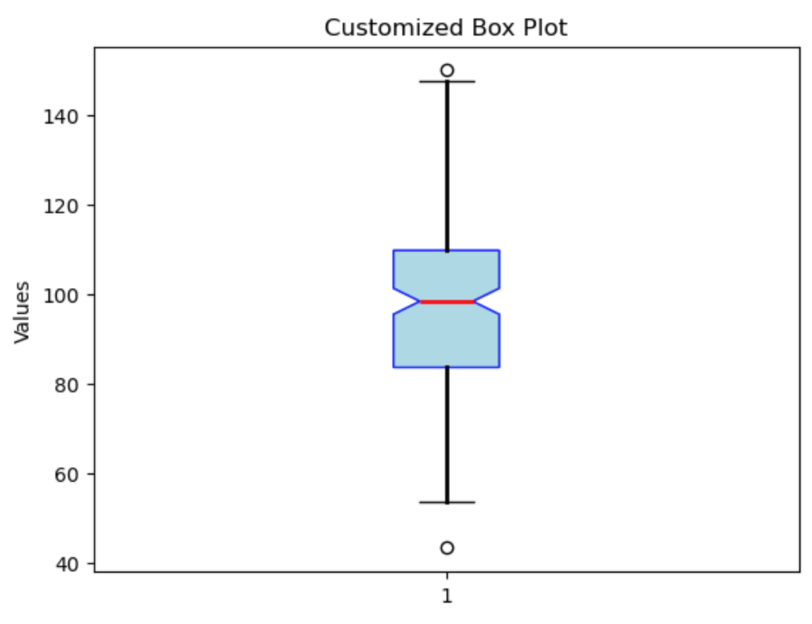
Customizing Box Plots
Matplotlib’s box plots are highly customizable. You can adjust parameters like whisker length, box colors, and outlier markers. Here’s an example showing a few customization options:
import matplotlib.pyplot as plt
import numpy as np

# Generate sample data
data = np.random.normal(100, 20, 200)

# Customize the box plot with additional parameters
plt.boxplot(data,
            notch=True,              # Creates a notched box plot
            vert=True,               # Vertical box plot (set to False for horizontal)
            patch_artist=True,       # Fill the box with color
            showfliers=True,         # Show outliers
            whiskerprops=dict(linewidth=2),
            boxprops=dict(facecolor='lightblue', color='blue'),
            medianprops=dict(color='red', linewidth=2))

# Add title and labels
plt.title('Customized Box Plot')
plt.ylabel('Values')

# Display the plot
plt.show()
Key Customizations:
- Notches: The
notch=Trueoption adds a notch to the box, which can give a rough idea of the confidence interval around the median. - Patch Artist: Setting
patch_artist=Trueallows you to fill the box with a specified color. - Custom Properties: The dictionaries passed to
whiskerprops,boxprops, andmedianpropsenable detailed customization of the plot’s appearance.
Conclusion
Box plots are an essential tool for statistical visualization, offering a concise summary of the distribution, spread, and outliers within a dataset. Whether you’re using Matplotlib, Seaborn or leveraging Pandas for convenience, Python makes it straightforward to generate and customize box plots. By following the examples in this article, you should be able to create box plots tailored to your specific needs and effectively communicate the insights hidden within your data.